This article is more than one year old. Older articles may contain outdated content. Check that the information in the page has not become incorrect since its publication.
Kubernetes UX Survey Infographic
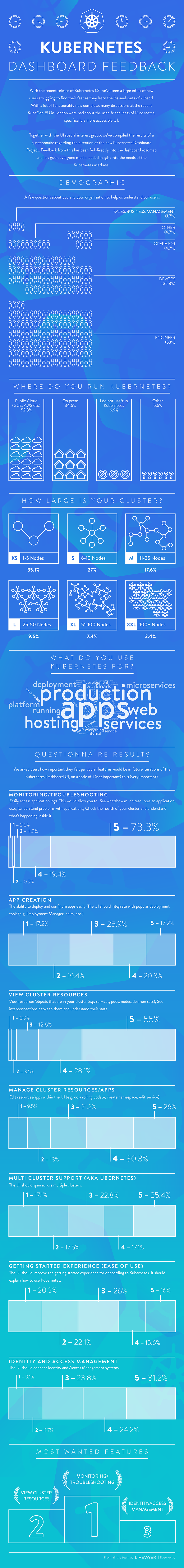
The following infographic summarizes the findings of a survey that the team behind Dashboard, the official web UI for Kubernetes, sent during KubeCon in November 2016. Following the KubeCon launch of the survey, it was promoted on Twitter and various Slack channels over a two week period and generated over 100 responses. We’re delighted with the data it provides us to now make feature and roadmap decisions more in-line with the needs of you, our users.
Satisfaction with Dashboard

Less than a year old, Dashboard is still very early in its development and we realize it has a long way to go, but it was encouraging to hear it’s tracking on the axis of MVP and even with its basic feature set is adding value for people. Respondents indicated that they like how quickly the Dashboard project is moving forward and the activity level of its contributors. Specific appreciation was given for the value Dashboard brings to first-time Kubernetes users and encouraging exploration. Frustration voiced around Dashboard centered on its limited capabilities: notably, the lack of RBAC and limited visualization of cluster objects and their relationships.
Respondent Demographics

Kubernetes Usage

People are using Dashboard in production, which is fantastic; it’s that setting that the team is focused on optimizing for.
Feature Priority

In building Dashboard, we want to continually make alignments between the needs of Kubernetes users and our product. Feature areas have intentionally been kept as high-level as possible, so that UX designers on the Dashboard team can creatively transform those use cases into specific features. While there’s nothing wrong with “faster horses”, we want to make sure we’re creating an environment for the best possible innovation to flourish.
Troubleshooting & Debugging as a strong frontrunner in requested feature area is consistent with the previous KubeCon survey, and this is now our top area of investment. Currently in-progress is the ability to be able to exec into a Pod, and next up will be providing aggregated logs views across objects. One of a UI’s strengths over a CLI is its ability to show things, and the troubleshooting and debugging feature area is a prime application of this capability.
In addition to a continued ongoing investment in troubleshooting and debugging functionality, the other focus of the Dashboard team’s efforts currently is RBAC / IAM within Dashboard. Though #4 on the ranking of feature areas, In various conversations at KubeCon and the days following, this emerged as a top-requested feature of Dashboard, and the one people were most passionate about. This is a deal-breaker for many companies, and we’re confident its enablement will open many doors for Dashboard’s use in production.
Conclusion
It’s invaluable to have data from Kubernetes users on how they’re putting Dashboard to use and how well it’s serving their needs. If you missed the survey response window but still have something you’d like to share, we’d love to connect with you and hear feedback or answer questions:
- Email us at the SIG-UI mailing list
- Chat with us on the Kubernetes Slack #SIG-UI channel
- Join our weekly meetings at 4PM CEST. See the SIG-UI calendar for details.